Article:
Personal Sanctuaries
Crafting identity in a Jamison Park house
BY KRISTEN SCHRUM | PHOTOS COURTESY OF ABIGAIL JACKSON PHOTOGRAPHY
AIn a world where the line between home and life blur more with each passing day, interior design has evolved into more than just aesthetics—it’s about creating a space that reflects the souls of those who inhabit it. Kristyn Bock from Kristyn Bock Interiors has masterfully captured this essence in a house in Apex’s Jamison Park neighborhood, where every room tells a story, every corner holds a secret and every surface echoes the depth and personality of the owners.
The clients’ desire for a home that is airy yet moody and both open and intimate has been the guiding principle of this design odyssey. Bock shares that the homeowners wanted spaces that “bring color in but still keep some neutral palettes,” striking a balance between boldness and tranquility. This equilibrium is evident in the monochromatic gray office, which is dedicated to productivity while simultaneously acting as a sanctuary of personal history. The paintings adorning the walls are not just art; they are memories painted by the client’s mother, adding layers of meaning and depth to the moody atmosphere. The space is complemented by light Roman shades.
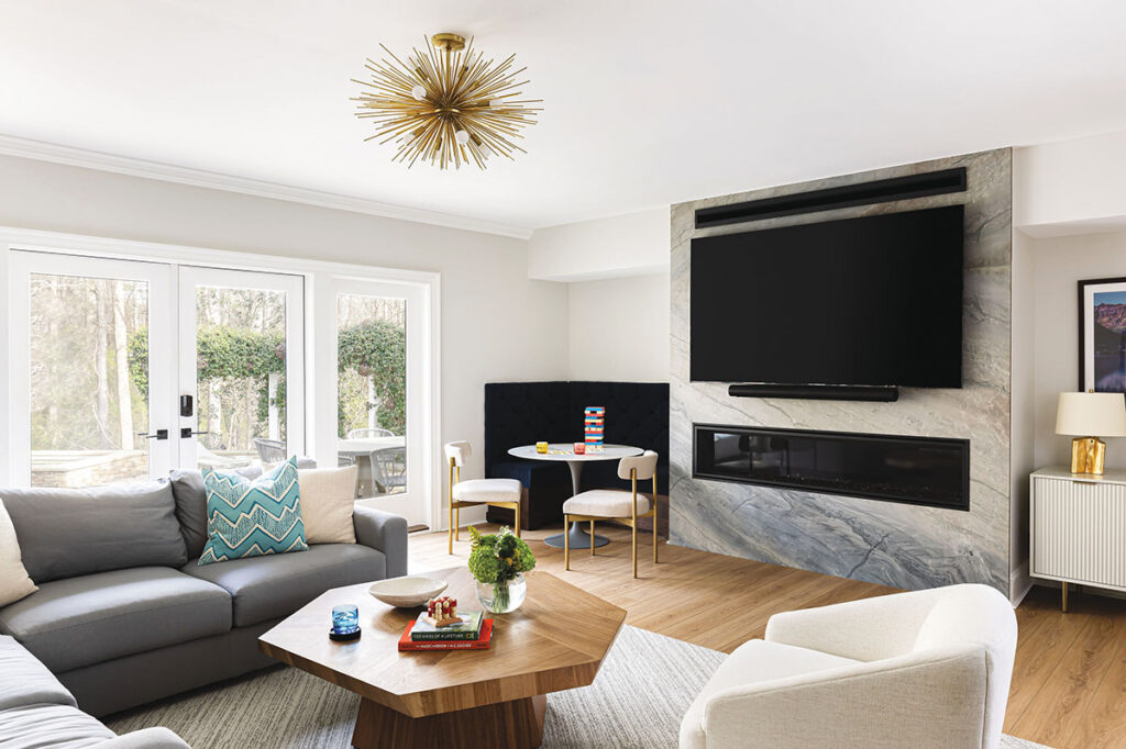
Bock summarizes her design philosophy for this house this way: “People want homes to be bolder and filled with more personality because people are spending more time in their homes.” And indeed, personality is what the Jamison Park house exudes, with patterns, textures and colors that speak volumes. The clients’ affinity for national parks has inspired the artwork and the materials chosen throughout their residence. The blue ocean quartzite kitchen countertops and basement fireplace, as well as the soapstone in the main living area, invoke the clients’ appreciation for natural beauty
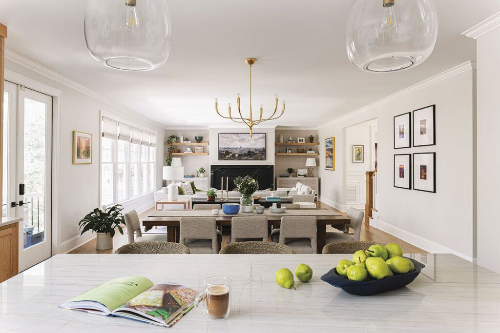
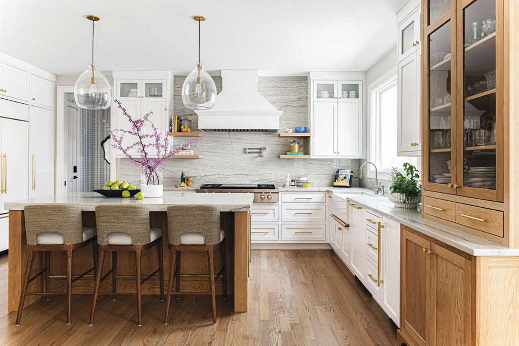
The interior design trends of the Jamison Park house are a clear departure from the ubiquitous colorless kitchen. As Bock points out, “Most people are over a white kitchen.” Instead, there’s a gravitation toward greens and earthier tones. These shades infuse the kitchen space with warmth, creating an inviting hub for culinary exploration and social gatherings. The navy and gray cabinets that once dominated the color palette of many modern kitchens are being replaced by more organic hues.
As the residents are keen on entertaining, the house embraces an open-concept design, fostering an environment where guests can move freely and socialize comfortably. The craftsmanship, reminiscent of the Morris era, reflects a trend that has made a resolute comeback in the use of exposed beams or rustic furniture pieces, indicating a collective yearning for a return to classic and time-honored decor. However, the pièce de résistance of the Jamison Park house is the grand, dark blue powder room adorned with Alpine Hygge & West wallpaper, which provides that “wow” factor essential for clients who love to host. The wallpaper, rich with patterns, and the room’s overall design encapsulate the essence of what the clients envisioned: a home that’s as much a statement of their personality as it is a living, breathing space.
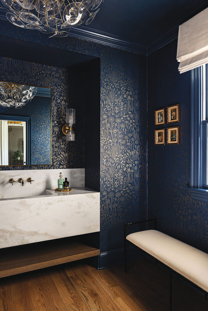
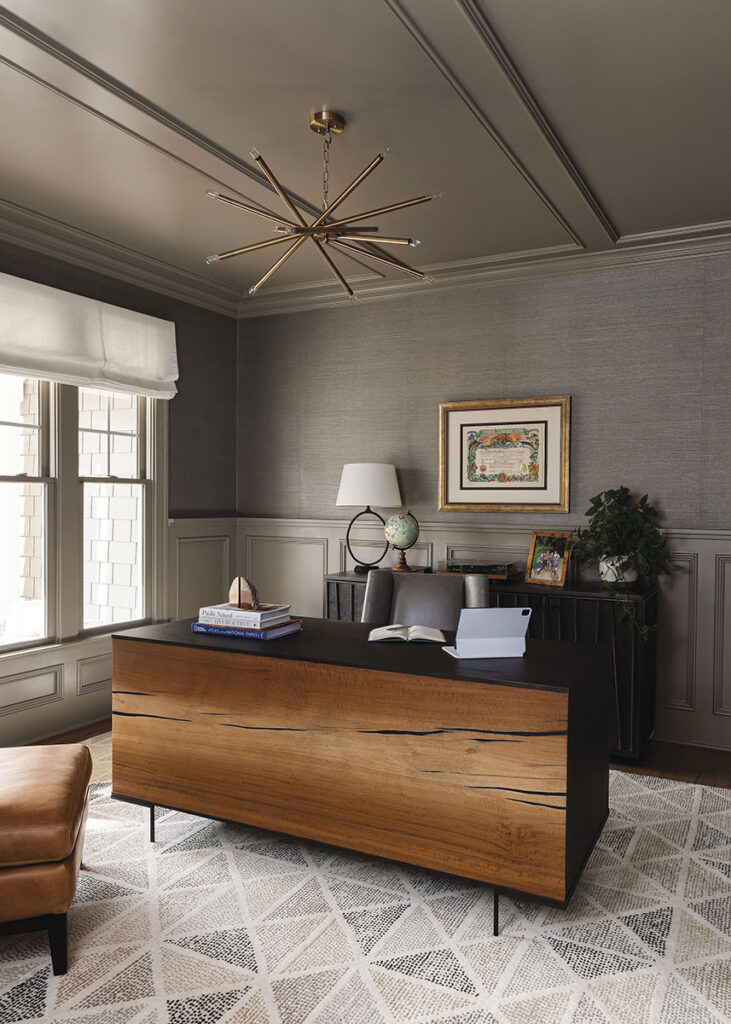
Reflecting on the resurgence of wallpaper, Bock observes that there is a current trend toward “more patterns and texture” through which homeowners seek to imbue their spaces with layers of visual and tactile interest. It’s a move toward a world where each wall, each fixture, each furnishing can stand as a piece of art in itself.
“People want depth now—not just airy and light rooms,” Bock states. She sees her vision for the Jamison Park house as a microcosm of the larger shift in interior design trends: a move toward spaces that are not just bright and ethereal, but also possess a richness that can be felt as much as seen.
The Jamison Park house is a testament to the growing desire for homes that are personalized sanctuaries, reflecting the individuality of their inhabitants. It’s a place where craftsmanship is celebrated, where the warmth of color triumphs over the sterility of monochrome, and where the durability and natural beauty of materials are favored over the less robust, albeit popular, choices of yesteryear. The end result is a cohesive environment where warmth and personalization are paramount, creating not just a house, but a haven for those who dwell within.
Walls that WOW
An inside look at the resurgence of wallpaper—with emerging trends, tips and tricks from two North Carolina–based design mavens.
BY KATELYN RUTT | PHOTOS COURTESY OF COURTNEY MELLOTT
Throughout the decades, walls have stood as canvases for self-expression, embracing a range of trends—from paint to silk, tapestries, mosaics and beyond. We now find ourselves amidst the resounding comeback of an interior design classic: wallpaper. Gone are the days when wallpaper was relegated to floral and vintage patterns; today, it re-emerges as a dynamic and versatile tool that allows designers to break free from traditional constraints. From swirling watercolor hues to daring patterns and personalized murals, wallpaper now has the ability to create spaces filled with harmony that reflect the distinctive and multidimensional essence of those who call them home.
For Courtney Mellott, designer and owner of Courtney Mellott Interiors—a residential interior design firm based in Raleigh—wallpaper is a staple in her design arsenal.
“I love wallpaper,” Mellott says. “I try to always use it at least once or twice in a project. To some clients it can be scary or daunting, but I always say, ‘Let’s start with the powder room. That can be your moment to go a little out of the box or to have fun with some colors you want to incorporate in your home.’ I think wallpaper can really make a space feel special and unique, while also bringing it to life.”
The designer, whose portfolio is brimming with Carolina blue, sea greens and botanicals, is adept at integrating her personal design style with the latest trends. Mellott’s color preferences, specifically within the context of coastal hues, are a seamless fit for the classic and whimsical wallpapers now rising in popularity.
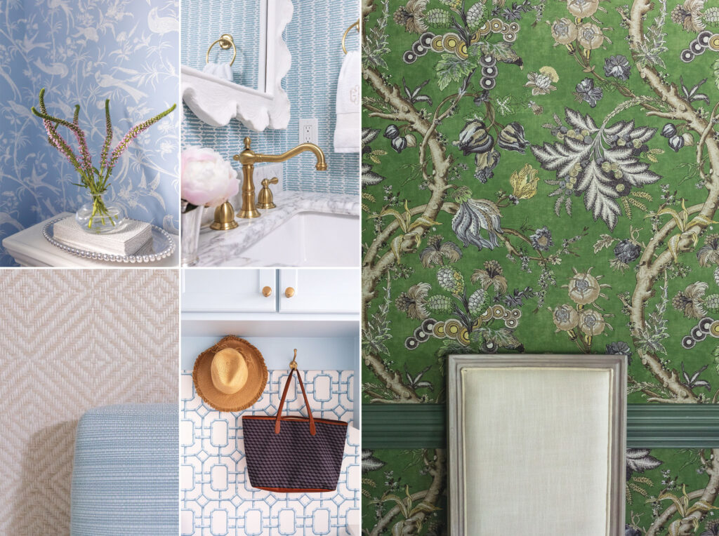
“There will always be plenty of options for blue patterns and colorways, but I think green is really having a moment,” Mellott says. “Whether it be a rich, dark green or a cooler light green, I think we are going to see more greens in wallpapers and fabrics. Hand-blocked fabrics are also popular right now, so there will likely be more wallpapers that mimic those patterns.” Regardless of the ever-changing trends, Mellott grounds her design approach in an enduring appreciation for timeless textures. The designer often turns to grasscloth, appreciating its ability to introduce depth and dimension to living areas. When it comes to darker rooms or navigating low ceilings, Mellott favors textured wallpaper, highlighting its knack for making a space feel larger.
“If I have a client that is ‘wallpaper happy,’ meaning they want to use wallpaper in a lot of places, I start with the largest room first,” Mellott says. “We pick out the design and color scheme and then work our way towards the smaller rooms. I think mixing colors and patterns is a lot of fun, and my advice would be to not pick something completely random. Make sure the colors are incorporated in the room or house somewhere, even if it is a little pop of color.”
Much like Mellott, Rebecca Driggs—principal designer of Rebecca Driggs Interiors, located in Wake Forest—selects wallpapers with intention. Specializing in a warm, modern style for high-end new construction and renovation projects, Driggs adheres to a set of core principles to ensure a consistent appearance throughout each home.
“Use similar tones from room to room,” Driggs says. “Employ complementary colors, vary the scale of patterns, and stay true to your chosen style, whether it’s traditional, modern, or other.”
The designer opts for wallpaper when aiming to elevate a room’s style, and notes a rising client preference toward organic and floral motifs, as well as watercolor detailing. Driggs is known for infusing modern touches into more traditional styles, and skillfully blurs the line between feminine and masculine aesthetics. Her proficiency lies in making visually striking design statements, often utilizing wallpaper to transform powder rooms or applying it over wainscoting in dining areas.
“I’m naturally inclined toward blues, greens and neutrals when it comes to design, and this holds true for my wallpaper preferences,” Driggs says. “Right now I’m particularly drawn to wallpapers that mix either blue or green with an accent color, and my favorite accent is a blush.”
Looking ahead, Driggs foresees custom murals emerging as a key player in the ongoing revitalization of wallpaper due to their ability to express a homeowner’s interests and personality. She emphasizes that opting for bespoke wallpaper “is an excellent choice when aiming to incorporate a particular color, texture or theme into your design.” As wallpaper trends evolve, Driggs anticipates growing alongside them, allowing them to inspire and fuel her creativity as a designer—an invaluable piece of advice for those seeking to embrace this trend in their homes.
“Challenge yourself to step out of your comfort zone,” Driggs says. “The risk will be worth the reward.”

