Article:
BY CAITLIN WHEELER
There was a time when shades of pale in home interiors were all you could find in design magazines or on home improvement store shelves. From white to beige, the look was the same: calm, simple and clean. It remains popular—just browse through a West Elm or Restoration Hardware catalog to see this look in all its splendor.
But “greige” was never an option for Nichole Blough, owner of Cary-based Nichole Blough Interiors, for whom animal prints are “neutral.” “White on white is classic,” she says, “but there’s only so much you can design with neutral colors before it veers into the mundane. I want to design spaces that people are going to remember!”
She’s not alone. “Southern style” has, according to Sanford-based Sweet Southern Home and Design’s owner Ashley Davenport, stayed true to its trademark blend of classic elegance with warmth, personality, bright colors, a variety of textures and patterns, and a mix of older heirlooms with fresh, new pieces. Davenport says these cheerful, fun elements have been making their way back into mainstream interior design over the last few years. “Twenty years ago, you had to want to see really bright, creative design,” she says. “Now it’s all so readily available to everyone. TV designers, network shows and social media have shown wallpaper and bright colors, and people are getting comfortable with it.”
Both Blough and Davenport balance out their innately classic Southern exuberance by adopting the best features of the “calm” interior design playbook. Two recent projects beautifully capture the essence of their thoroughly modern—and fun—Southern style.
SOPHISTICATED, SELF-ASSURED AND SOCIAL IN SANFORD
Davenport shifted from corporate marketing to interior design in 2018, but has always taken on small design projects for friends. Enter Chas and Kimberly, who propositioned Davenport with a home Chas had been eyeing since he was a young boy, having grown up just down the street from it. “I’ve always admired it,” he says. “It sits up on a corner of a wooded lot—just gorgeous—and every time I saw the owner, I used to tell him how much I liked it. When Kim and I saw it was on the market, we jumped.”
Upon seeing the interiors for the first time, Chas appreciated its grand proportions, open floor plan and “regal staircase.” But the outdated décor? Not so much. “It was all dark wood with burgundy and navy walls and carpets. And throughout, there was this green tile imported from Mexico.”
Chas and Kimberly tasked Davenport with transforming the home from dark and dated, to bright and airy. “She hit the bullseye,” Chas says.
Davenport’s Design Tip No. 1: The process of decorating a home should be fun! Choose a designer you love and trust some of the designer’s more creative suggestions.
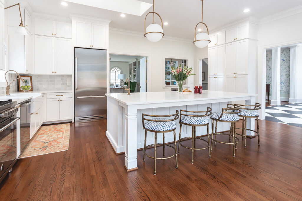
The kitchen needed a complete overhaul, down to the studs. “Chas and Kimberly are both lawyers and do a lot of entertaining and hosting fundraisers, and we wanted the kitchen to be supremely functional, as well as an elegant and inviting social space,” Davenport says.
She started with a clean and simple design, then added gold hardware and patterned backsplashes in traditional marble for a touch of refinement. “We had fun with some modern light fixtures, and bar stools that hit the spot between traditional, with a bamboo frame, and modern, with a slightly trendy seat fabric.”
Davenport’s Design Tip No. 2: Do consider long-term, and whether you’ll appreciate the latest trend in five years. Lay the groundwork with timeless pieces—then you can add a couple of small, trendy twists.
Chas and Kimberly’s open plan living space allows for expansive sightlines from the simple kitchen to the bar area, and through large French doors into the patio and garden. These social spaces serve as the heart of the home, and Chas says he particularly loves their outdoor area’s grassy areas, as well as the covered patio with fireplace and squishy lounge chairs.
Chas occasionally takes refuge from social events in his secret study off the master bedroom, which includes a comfortable leather chair, rustic cowhide rug, floor-to-ceiling windows and what Chas calls a “too-good-looking-to-drink” bourbon collection. Davenport says she likes to have one “star player in a space that you can fall in love with, then work the room around it.” For Chas’ secret study, the black-and-white checkered floor claimed that role, “and we played off it with the chestnut tones of the bar and the gold light fixtures and side chair” Davenport says.
Davenport’s Design Tip No. 3: Don’t forget the “fifth wall.” Wallpapering or painting a ceiling can really energize a room.
In the dining room, Davenport added a wallpapered accent wall.
“We chose a classic wallpaper in light, natural greens and blues, invoking the nearby garden,” she says, noting that while murals are “having a moment” on Instagram, beautiful wallpaper never goes out of style. She complemented the traditional paper with a small display of antique plates and dark wood furniture, then balanced those items with a neutral, abstractly modern rug and contemporary chandelier.
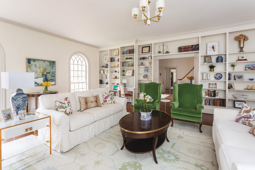
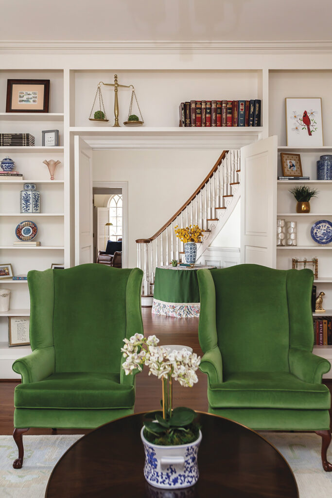
The living room design would have to accommodate multiple roles, from formal entertaining to family TV night, and Davenport wanted to make sure it was as elegant and comfortable as the kitchen. She reupholstered a pair of antique high-backed, winged armchairs Chas owned in a rich green velvet, which easily took center stage.
The rest of the living room features neutrals—in the rug and on the walls. Davenport mixed subtle, classical style via the dark wood coffee table and slightly contrasting wall trim, with modern touches—from the sleek gold and glass end table, to the comfortable imprecision of the slipcovered sofas.
She kept décor to a minimum in the living room—and throughout the home. “Chas and Kim are not clutter-type people,” she says. “They’ve got two young boys under age 8, as well as a dog, and somehow the home is always spotless and looks just like [it does in] the photo shoot.”
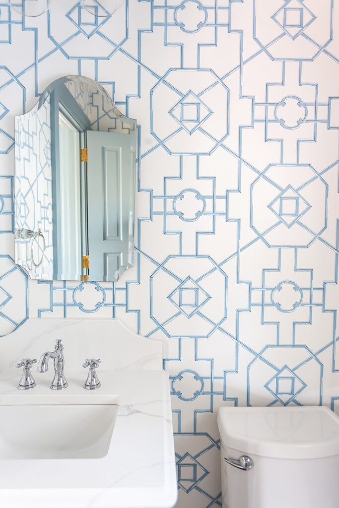
The overall modern look of clean lines and open space gave Davenport the chance to work in more of her favorite Southern touch: wallpaper. There are at least six different bold wallpapers in Chas and Kimberly’s home, from a pale blue geometric pattern in the powder room, to a “cute but masculine” dog print in the boys’ bathroom. “Wallpaper is less frightening than it was 20 years ago,” she says. “A lot of work has gone into making it easier to apply, clean and, most importantly, remove.”
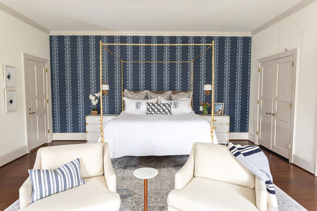
“I love the dark blue linear print in our bedroom,” Chas says. “Ashley championed the accent wall, and she was right—it looks really incredible with the bright gold of the simple, modern bedframe.”
CLASSIC, COLORFUL AND COASTAL IN CARY
Nichole Blough has been interior designing since she was 5 years old, when she started asking to have her room repainted every year for her birthday. At age 10, she convinced her mother to put a leopard-print runner on their stairs. (“It was there for years,” she laughs.) And as a teenager, Blough worked for a paint shop. Today, she carries all of these experiences—plus her Southern roots, love of color and sense of fun—into current projects, which include this full house redesign in Cary.
Blough’s clients hoped she could make their home more comfortable for their family, as well as beautiful and welcoming for guests. Their three boys range from elementary school–age to college freshman, and they have two golden retrievers—one of which is still a rambunctious puppy. Their home is busy and well-used. “We love being the go-to hangout house, and having the boys and their friends around,” the client says. “Plus, we love to entertain our friends, and host big gatherings for holidays and birthdays.”
The original kitchen offered minimal natural light and dark cherry wood cabinets that, according to the client, were “lovely” but had started to look “all brown and orangey.” The entire space needed a bright uplift.
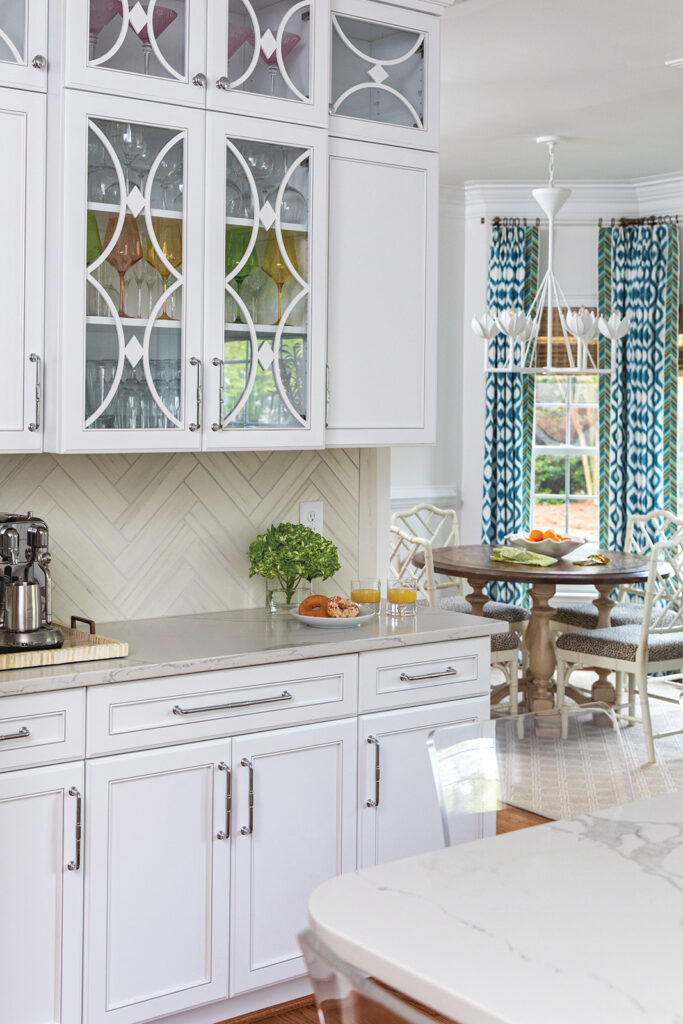
Blough went with white cabinets, white quartz countertops and a marble backsplash. “I love color more than anyone, but an investment like a kitchen needs to be as timeless as possible,” Blough says. Now, light pours in and the spacious island has become the family’s favorite spot for casual meals, homework, arts and crafts, and baking.
Blough contrasted the somewhat formal kitchen with a beachy vibe in the attached breakfast nook, selecting bamboo chairs, ocean blue print curtains and a whimsical tulip chandelier for the space. Blough’s client grew up in Florida and enjoys a beach house theme, but her North Carolina–bred husband has slightly more conservative tastes. “It took some convincing to get him to commit to the cheetah print seat cushions,” she laughs.
Blough’s Design Tip No. 1: When there is a neutral backdrop, add pops of color with accessories that are easily interchangeable—like drapery, upholstery and rugs.
Blough re-imagined the small sitting area off the kitchen as a bar.
The remodeled room perfectly captures Blough’s modernized Southern style. Yes, there’s color, but the deep blue bar is fresh and muted. The bar stool’s classic but subtle black pinstripe will never go out of style. And the grass cloth wallpaper is neutral, natural and timeless. “My 107-year-old great aunt in Raleigh has grass cloth in her foyer, and it still looks up-to-date,” Blough says. The gold starburst light fixture adds a punch of elegance and fun.
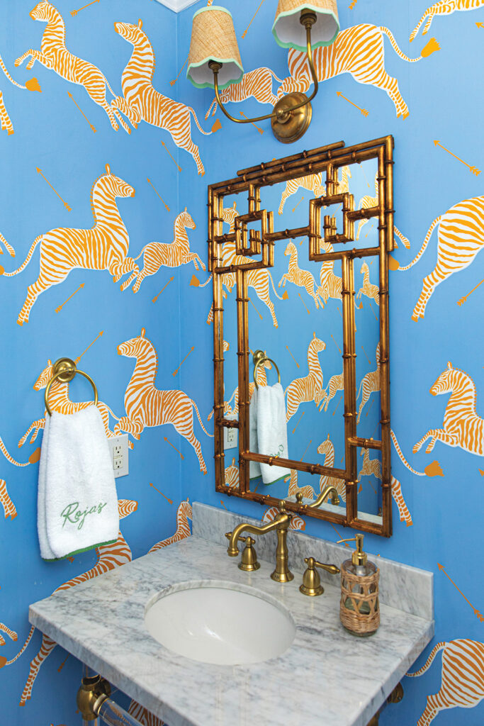
Blough went with a bolder look in the nearby half-bath. “I’ve always loved Scalamandré’s iconic zebra wallpaper,” Blough says. “I didn’t know if the clients were bold enough to go with the zebras in pale blue and gold—but was thrilled when they agreed!”
Blough’s Design Tip No. 2: If you’re intrigued but hesitant to try wallpaper, start with a small space. Powder rooms are a great place to go bold, giving you a pop of color and pattern without being so “in your face.”
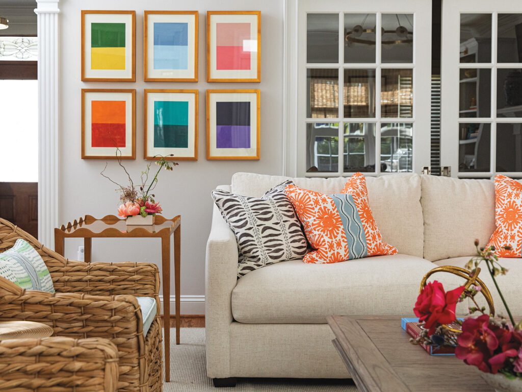
In the living room, Blough combined traditional and modern pieces for a fresh and “quintessentially Southern style” by contrasting older items with coastal style—from comfortable rattan chairs with bright orange and blue pillows, to a pair of soft swivel chairs upholstered in a bold navy print. “It’s beautiful, but in such a livable way,” the client says. “It’s really bright with all the blues and oranges and greens, and just perfectly reflects the happiness and joy of our family. Our seven-year-old’s favorite chair is the blue swivel—but don’t even think about taking it! He makes a beeline for it when he gets home from school.”
Blough is always on the lookout for antique or heirloom pieces that will achieve classic Southern style, and shops local antique shops and estate sales to find them. “I have a whole collection—and I have it internally indexed, so that when I’m working on a project, I can think of a piece I have and know it would be perfect for that space,” she says.
Blough also has a particular passion for modern art, especially by current, local artists. She will look at a nearly-finished room, get a sense of the art it needs, and often commission pieces from local artists. “That way, I can tell them exactly the color scheme and style I’m looking for,” she says. “The finished piece is never exactly what you imagine, which adds to the thrill.”
For this home, she commissioned art for the bar area—to contrast with the room’s subdued hues—and the half bath, which features the already bright and bold Scalamandré zebra wallpaper. By commissioning an equally bold but unique and modern pair of pieces, Blough created a purposeful and structured contrast, rather than a disorienting tangle of color and form.
It all works for her clients. “Our family has a ton of energy,” says the client. “We think Nichole’s design really embraces and reflects that.”
Check out more stories from around Western Wake at 5westmag.com.
